Stock
9 things I learned about the world according to anonymous stock photo models.
12:43 PM
, # ,
|
Saturday, April 28, 2007
Hot Docs Awards Night

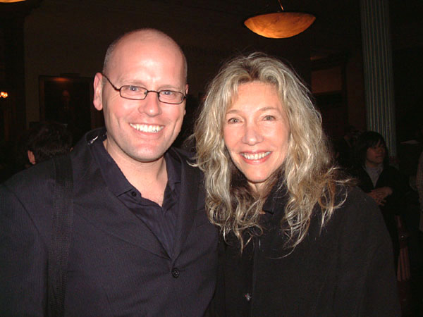
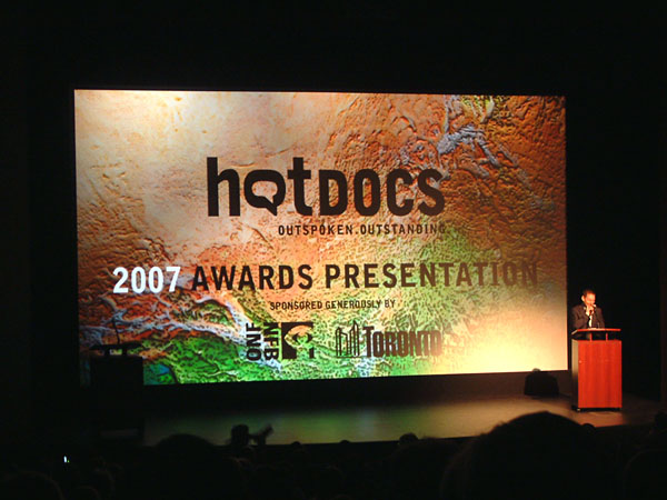
I wasn't taking pics at the party tonight, but I turned into fanboy when I saw Linda McQuaig and had my picture taken with her. Below is a picture of Avi Lewis hosting the awards show. The backdrop is created from a close-up of the papier mache ... in fact, if you look at the cover of the programme guide you can see that it's Central Africa.
Sunday is the last day of the festival and I'll be wrapping up the Hot Docs blog, shortly after!
3:12 AM
, # ,
|
Friday, April 27, 2007
More on the Globe Look ...
AZ quoted me in her Star column today. I think I agree with what Lucie Lacava said:
Montreal-based Lucie Lacava, one of the world's most celebrated newspaper design consultants, has mixed feelings.Except I would give it a six.
update: For some context, here's how I'd rate some other redesigns (out of 10):
EYE WEEKLY redesign: 9
Last Globe redesign: 8.5
Last Star redesign: 8
National Post: 7.5
Sunday Star: 5
Toronto Sun redesign: 3
It's fun to rate things.
10:22 AM
, # ,
|
Watch Online
You can watch Bill Moyers' PBS doc about how journalists helped sell the Iraq war, online.
2:08 AM
, # ,
|
Tuesday, April 24, 2007
Birthday Man

My nephew, JT001, turns 3 today. Happy birthday!
12:06 PM
, # ,
|
15 Seconds
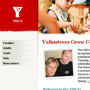
 Hey, I'm getting my fifteen seconds of fame on the Greater Toronto YMCA website.
h/t Merv
12:01 PM
, # ,
|
Monday, April 23, 2007
Facelift Disaster
The redesigned Globe and Mail caught my eye this morning, so I picked up a copy (see it here). Enthusiasm quickly turned to disappointment and then horror as it became clear that instead of redesigning the paper, they'd de-designed it.
The page layout and design has been one of the Globe's strengths since their last redesign several years ago. Instead of building on that, the new look throws out the good and replaces it with an uncomfortable mating of National Post with Toronto Star Sunday Edition .... using the worst of both. The layout is messy and reminds you of unfocused paper layouts of the 1980s.
Perhaps the root of the problem is that this was an in-house job. In-house redesigns can become disasters because the people doing the work are just too connected with their organization's culture and politics. It takes an outsider to be able to take a more objective view and make hard decisions.
Here's a list of the bad:
Ideas
In the end, it all comes down to ideas. The in-house designers who came up with this didn't seem to have many. Or, more likely, they had competing ideas and the result was a design where all the good was dumped. The ideas that survived -- and there aren't amny of them -- are weak and don't serve a 163-year-old national newspaper.
Nameplate & Banner
Created a couple of redesigns ago, the nameplate clashes with the new design.
Bars, bars, bars
The new design consists mostly of plugging thick black bars all over the place. And dotted lines. And thin lines. And grey bars. The previous layout was distinctive ... this looks cheap.
Heading font
The custom Globe & Mail sans font apes the headline font used by the Sunday Star. And not very well. Font weights and styles are all over the place .... instead of coming up with some rules before the launch, they appear to be test-driving the fonts live.
Paper
A comment at Newsdesigner.com asks if the paper quality has changed. It seems to be smoother and lighter ... but difficult to tell if it's cheaper. It might just feel cheap because the layout looks cheap.
The Bottom Line:
I get my news online, like more and more people these days. I think of the paper newspaper as a luxury item to relax with a couple of times a week, especially on the weekends. Reading the newspaper -- the paper version -- is pleasurable and good design is part of that experience. I'm less likely to pick up the Globe if it looks ugly ... and this new design is ugly. And I don't want it in my home.
12:22 PM
, # ,
|
Sunday, April 22, 2007
Hot Docs Blog
People have been telling me that the easiest way to get to the Hot Docs blog is to come here and follow the link. Here it is again:
THE HOT DOCS BLOG
And, if you would like the URL, it's this:
http://blog.360.yahoo.com/blog-iioTGSM5dLInGC5v1VC8IO1uyVui7zb6GhY-?cq=1
Good luck!
5:41 PM
, # ,
|
Saturday, April 21, 2007
Never Leave Your Computer
5:24 PM
, # ,
|
Friday, April 20, 2007
City Nearly Broke

It was ten year's ago this month that I started drawing the editorial cartoons for the Annex Gleaner. At that time, the issue facing the city was amalgamation by the Harris Tories ... and a decade later, that act has left the city teetering on the edge of bankruptcy. Many of those who vocally supported this mess or collaborated with Harris -- Case Oootes, Royson James of the Toronto Star, Alan Tonks and others -- are still around. If the city needs $200 million to keep running, I think they should pony up.
11:50 AM
, # ,
|
Thursday, April 19, 2007

In just a few hours the 14th annual Hot Docs Canadian International Documentary festival kicks off with the opening night screening of In the Shadow of the Moon, followed by the Opening Night Party.
For me, work on this year's fest started the day after last year's ended. Production ramped up right after the new year started and has been flat out crazy ever since with the last two months being especially intense. The fest is bigger and better this year and a lot of people have put a lot of hard work into making that possible. And now it's time to have some FUN!
For updates on festival news, check in with the Hot Docs Daily and I'll be proving the insider's look at what's happening on the official Hot Docs blog.
btw, a quarter of this year's films have already gone rush but you can still get ticket for Billy the Kid, one of the highlights of this year's fest. It's difficult to explain the charm of that flick, but you have to check it out.
11 days ... and after that, SLEEP!
5:11 PM
, # ,
|
Who Mourns for Sanjaya
I've never watched more than five minutes of the American Idol (or any Idol) Show. But tonight I was waiting for the streetcar at College & Yonge and American Idol was playing on the tv inside the condo sales office ... and just as I glanced in , they announced that Sanjaya was being kicked off.
And I was heartbroken.
Johnny died one night, died in his bed
Bottle of whisky, sleeping tablets by his head
Johnny's life passed him by like a warm summer day
If you listen to the wind you can still hear him play
Don't you know that You are a shooting star
Don't you know?
Don't you know that You are a shooting star
And all the world will love you just as long
as long as you are!!!!!!!!!!!
4:25 AM
, # ,
|
Wednesday, April 18, 2007
Hot Blog
The Hot Docs blog is kicking into gear. There's going to be lots of blog action there over the next two weeks. In the most recent posts, Anita is a doc celebrity and Merv checks out the globe ...
11:39 AM
, # ,
|
Saturday, April 14, 2007
Weekend Inspiration
1:47 AM
, # ,
|
Thursday, April 12, 2007
The 'How to Link to Hot Docs Blog' Post
Had some complaints about that Hot Docs blog link. It takes you to the profile page, but not directly to the blog itself. Let see if we can get a link going ... try this: THE HOT DOCS BLOG.
Yahoo360. 360 is the number of characters in your blog link.
And now, the Yahoo360 quickie review:
I've been using Yahoo360 for about a week now and I have no idea why anyone would choose to use it; not with so many easy, useful alternatives (which ones? All of them.) There are just too many layers. I wear a lot of layers when I take the dog out at night in the winter ... but I don't enjoy all those layers.
Also, Yahoo360 hogs the most valuable real estate for itself. I know that serving ads is the point of the thing ... but when the blog itself is stuck below the branding and advertising like an afterthought ... well, is the service serving you or are you serving the service?
2:12 AM
, # ,
|
Tuesday, April 10, 2007
Drama Drama
 The [draft] Blogger's Code of Conduct
I propose adding a seventh guideline to the code:
7. Self-important idiots shouldn't be allowed to make half-baked codes that, at best, will be completely shunned and, at worst, chill expression.
[ pic: Accordion Guy ]
1:50 AM
, # ,
|
Thursday, April 05, 2007
Festival Fun
It's the Hot Docs Festival Blog!
Technically, it's not really live yet ... but it's more complete than Windows Vista. It'll be much the same as the blogging I did last year, but instead of being here, it's there. Starting next week, it's going to be a busy blog, so check in.
8:14 PM
, # ,
|
Contact
info[at]brettlamb[dot]com
My Cartoon Archives
HAPPY CREATURE
MS. JOHNSON
ED LOCKE
Regular reads
Accordion Guy
Bill Doskoch
Daily Dose
Davezilla
Tony Pierce
Warren Kinsella
News
BlogTO
boingboing
Cursor
DIGG
Dork Shelf
Drawn!
FoodForethought
Fleshbot
Garlicster
Global Nerdy
MetaFilter
Mondoville
The Oil Drum
Reddit
The Register
Slashdot
Space.com
Spacing Wire
Torontoist
Treehugger
ZDNet
Arts & comics
Children of the Atom
Chromewaves
Comic Strip
Corrigan
DeadThingsonSticks
Dinosaur Comics
Hollywood North Report
Maakies
MacKay
Sally McKay
Secret Lair
Toronto Comic Jam
Zoilus
Audio
The Bugle
Coverville
Radio Clash
Ramdom Thoughts
Video Toronto blogs Canadian blogs USA blogs Oz blogs UK
Channel101
Circadian Shift
Consolation Champs
Crazy Biker Chick
Day in the Life
Dead Robot
Easternblot
estrojenn
Exhausticated
Free Clara
JB Warehouse & EmporiumLiz Vang
Luminescent
Marmalade
Merv
Naked KnitGirl
Photojunkie
Pony
Pshaw
Raymi the Minx
Robot Johnny
Searching for Tao
Secret Storm
Squiddity
TBIT
Simple Spendor
Sooey
Confessions of a Monkey
Dust My Broom
Grrl Meets World
Ian King
James Bow
Simple Spendor
Sooey
View from up here
Cityrag
democraticSPACE
Dooce
Explananda
Fred the Blog
Jett Superior
Maakies
MegaBeth
Panopticist
Yoon Choi
Brett Lamb: OZ
Little Lioness
Penguin Says Yes
B3TA
Rathergood
Create Your Badge
www.flickr.com
|
A R C H I V E S
2009
JANUARY
2008
JANUARY
FEBRUARY
MARCH
APRIL
MAY
JUNE
JULY
AUGUST
SEPTEMBER
OCTOBER
NOVEMBER
DECEMBER
2007
JANUARY
FEBRUARY
MARCH
APRIL
MAY
JUNE
JULY
AUGUST
SEPTEMBER
OCTOBER
NOVEMBER
DECEMBER
2006
JANUARY - 1
JANUARY - 2
FEBRUARY
MARCH
APRIL
MAY
JUNE
JULY
AUGUST
SEPTEMBER
OCTOBER
NOVEMBER
DECEMBER
APRIL
MAY
JUNE
JULY
AUGUST
2005
JANUARY
FEBRUARY
MARCH
APRIL
MAY
JUNE
JULY
AUGUST
SEPTEMBER
OCTOBER
NOVEMBER
DECEMBER
2004
MAY
JUNE
JULY
AUGUST
SEPTEMBER
OCTOBER
NOVEMBER
DECEMBER
[ 2003 ] [ 2002 ]
View My Stats


